Enterprise · Capital markets
PNC Bank Capital Markets
An end-to-end workflow for a corporate data analysis and monitoring dashboard: research and requirements, experience design and prototype, then visual system and UX copy aligned to PNC standards.
UI/UX workflow
The process moves from discovery into structure, then surface design and language together. Each phase produces artifacts that feed the next: aligned requirements, a consolidated interactive prototype, then brand-aligned visuals and UX copy that pass style and tone review before handoff.
Research & requirements
Human-centered research gathers input from stakeholders across PNC Finance and Sales and distills it into design-ready requirements. Outputs include customer journeys, service blueprints, stakeholder maps, and current- and future-state flowcharts—enabling shared agreement on problems, handoffs, and priorities before UI exploration starts.
Experience design & prototype
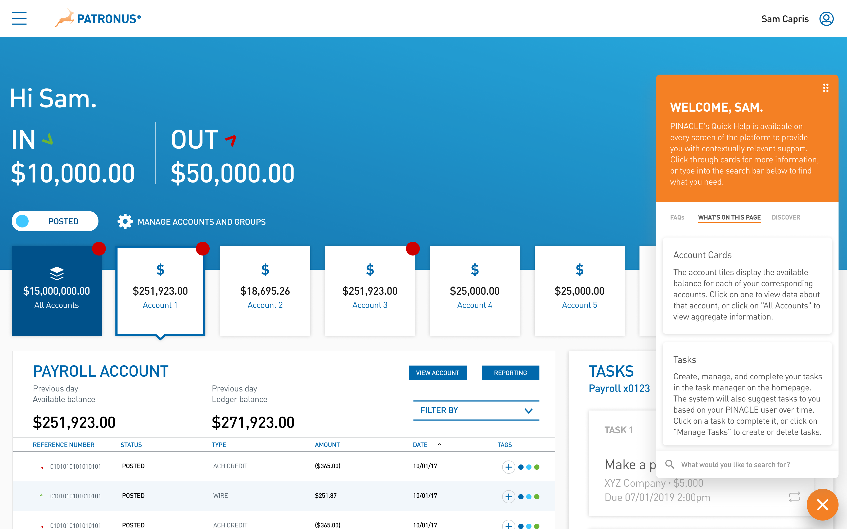
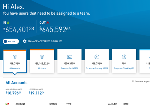
The experience layer targets an intuitive analysis and monitoring dashboard for corporate clients: information hierarchy for at-a-glance monitoring, paths into deeper analysis, and interaction patterns that ease cognitive load on dense financial data. A web application prototype (Sketch and InVision) consolidates multiple data sources into a single surface and removes redundant manual entry by presenting integrated, authoritative views.
Visual system
Color palettes, iconography, and typography are specified against PNC brand standards so the dashboard reads as part of the bank’s ecosystem while remaining legible and scannable for professional use.
Content & UX copy
Dashboard content and UX copy are drafted and refined against PNC style and tone guidelines: labels, empty states, and instructional language that carry institutional voice and prioritize clarity for compliance-sensitive contexts.
